Following discussions with a group of local residents, Alderley Edge Parish Council are looking to develop new boundary signs as they feel it is important to position much better signs to mark the road boundaries to our village, especially as there are no signs at all on some approaches.
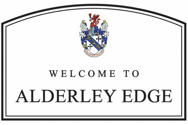
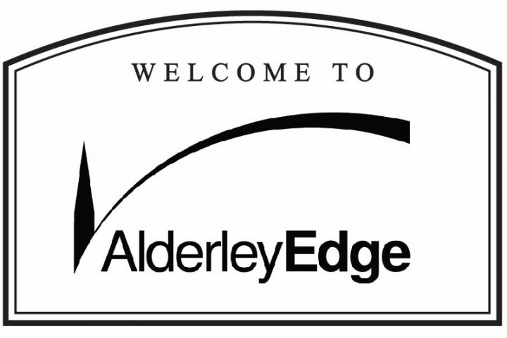
The Parish Council is now considering two options, either sticking with a more 'traditional' approach to boundary signs using ones similar to most towns and villages in the country. Alternatively, their preferred option is to use their new logo to create more "stylish" signs.
Councillor Mike Dudley Jones said "Many residents in Alderley Edge have commented very favourably on the new 'logo style' we have used, particularly in editions of the Parish Update magazine we distribute to every home in the Village, on a quarterly basis. However, not everyone is clear on what the 'logo' represents and we felt it was important to outline the background to it so that there is a wider understanding, especially as we have a strong desire to use this style in the Boundary Signs Project.
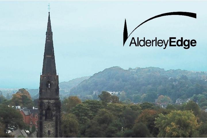
"As you approach Alderley Edge, almost from any direction, and especially by train, you will see the spires of either St Philip's Church or the Methodist Church. Rising up above the Village is the steep 'curve' towards 'The Edge', a landmark for which we are famous. It seemed appropriate, therefore, to focus a new logo design on 'the spire and rising curve' symbols. We felt that the design should be simple, clear and unique."
Alderley Edge Parish Council carried out some brief research at the Village Show on 1st September where they placed an A1 sized board to gauge reaction to these two options and to chat to people as they considered them.
Councillor Mike Dudley Jones explained "It became apparent that visibility was the principle concern and as the more traditional option showed black lettering on a white background this option was more favoured. Most did not favour the 'coat of arms' though. However, where the symbolism of the new logo was understood, many said they loved it. Others said they would have favoured a new, more modern look but only if it was more visible. Some also felt the new logo style was a little small and looked like a 'tick'!"
Since then the two options have been re-worked - see above - and the Parish Council would welome your opinion to help them develop this project.
Please consider the two options and decide which you believe to be the best for our Village and using the comment box below simply write Option 1 (coat of arms) or Option 2 (new logo), pus of course any feedback you wish to provide.

Comments
Here's what readers have had to say so far. Why not add your thoughts below.
Let's stick with tradition for once!
Tradition is always there when the current trendy modern ones become obsolete or are overtaken by even more modern ones !
May I please encourage as many residents as possible to respond here as it is important to ensure we go ahead with signage that we are all comfortable with.
May I please encourage as many residents as possible to respond here as it is important to ensure we go ahead with signage that we are all comfortable with.
Three observations:
1. The article in the AEPC newsletter; I personally feel is heavily biased in favour the new .
"tick" sign.
2. There are no costings for the replacement of these boundary signs in the newsletter or this article. In my experience they can be quite expensive (in the region of £2,500.00 to £3,000.00 each) - Having to replace? say 8? seems costly.
3. Not sure where the missing signs are off the top of my head, but surely a more sensible option to simply replace these with the current design.
With so much change already occurring in and around the village, I am personally of the opinion that this is one small piece of the tradition of Alderley Edge which should remain.
Option 2 looks like it should be outside a comprehensive school.
May I please encourage as many residents as possible to respond here as it is important to ensure we go ahead with signage that we are all comfortable with.
Mike’s quote says it all about option 2.
‘Not everyone’s clear what the logo represents’
If you have to explain the logo to locals then the casual visitor has little chance of understanding it.
Any new visitor entering Alderley Edge would just see a ‘tick’. My view is it’s lifeless , confusing and fails to do the job.
As an Alderley Edge In Bloom volunteer it has been disappointing to hear The ‘Britain In Bloom’ Judges comment that our current signage let’s us down.
Our neighbours in Wilmslow have some smart examples including neat planters housed beneath the signage.
Perhaps some discreet sponsorship could help cover the costs Ashley has described.
‘
Wilmslow Town Council purchased six new boundary signs in 2013 at a cost of £3900, plus installation costs.
Here's a more recent photo of one of the signs with the planting and the additional sign announcing their Gold award in the North West In Bloom competition. https://bit.ly/2RMbbwd
I do not like the look of the modern sign and as many others on here have commented, prefer the traditional one.
Option 2 will date very quickly; in fact it already looks old, like something that was done in the 90's we would rather forget about.
I was a little involved the last time (a few years ago) some such signs were re-placed.You'll need the permission of Cheshire East.
As I recall, the work/cost was all down to the then Parish Council. Why? Because that was much less costly that 'using' the Local Authority.
Along with Ashley C. D. (above), I'd like to see the costings please.
Also please how many new signs are anticipated? How many will be as replacements for existing signs? and how many will be in new places?
Also a list of where the signs would go?
Also it it envisaged that the whole cost would be to the Parish Council? Or will Cheshire East 'cough up- some of the cost?
I do not choose it because it is traditional, but because I am not impressed with Option 2, the Alderley “Tick”.
I have not received any of the five Newsletter’s through my letter box, although I did receive the Alderley Edge FIRST promotional material prior to it’s en bloc success at the 2015 elections. Therefore, until this article which prompted me to check the PC web site and I found the Newsletter’s, I was not aware that the council had re-branded, re-imaged or whatever, Alderley Edge.
I respect that someone spent time designing the logo, but what brief was given by the council? It is standard practice to define all the ways in which a design is expected to work, but it looks to me that on a road sign was not one of them.
For me the logo does not even work stand-alone, and I agree wholeheartedly with what Kelvin Briggs says of it. In my opinion the “tick” does not work, the large amount of white space between the long arc and Alderley Edge does not work. It just does not look professionally designed.
In the context of the road sign, it just looks like a logo with “Welcome to” stuck above it, which it is. Not only is it in a different font but the “tick” places a barrier with Alderley Edge. Not very welcoming!
There is good modern, and bad modern.
Our nearest competitor is Wilmslow (see Lisa’s link to their new signs) and they give a warm and genuine
WELCOME TO
WILMSLOW
All linked together, same font, and a similar size.
Please don’t let them be better than us at welcoming visitors to our village.
We could even go one better, and make the signs two sided, and yes I know there would be an extra cost. The reverse message could read “Thank you for visiting Alderley Edge”. A thank you is always appreciated.
The group felt it was important to offer a choice and like anything new there did need to be some extra explanation as to how Option 2 came about, whereas Option 1 was presented in a more 'familiar' form. In any event of course, the Parish Council will respond to the majority decision.
I can confirm that estimated costs are in line with Lisa's Wilmslow costs not the higher ones you may have seen - but the final detailed costs have yet to be finalised. Tooling charges for the engraving of a Coat of Arms for example are always going to be higher than for what some still see as 'a tick'!
Once the closing date has been reached the Boundary Sign group can develop the project further. Hopefully, before too long, visitors to Alderley Edge, will know when they have arrived here!
I love the concept of Option 2, but the design does not look as stylish.
Option 1 with cost of arms please on behalf of the whole family
I love the thinking behind option 2 but I think the execution is a few iterations away from being ready. Could the design team look at it again?
As others have said:
1. without the picture of the church and Edge, it’s not clear that it’s more than a tick
2. the font is quite bland - it doesn’t feel fresh and modern - and is too closely spaced
3. without knowing the curve of the tick is the Edge it doesn’t make sense to have Edge in bold
It would be a shame to discard option 2 because the execution isn’t right, when it has the potential to be original and unique.
Alternatively, could local design students be given a crack at a 3rd option? Either an iteration of those two options or something new?
Agree with Kelvin Briggs and Ashley C D. If you have to explain what the logo means you’ve got it wrong. I’m definitely one for progress, but this small piece of history and tradition is nice to keep
Chris Wilcox
With Alderley Edge in Bloom securing the 'Gold Award' in the North West In Bloom competition, how about a secondary plaque beneath the main one detailing the award as per the fine signage that Wilmslow have invested in?
Have a look at the signage as you enter Wilmslow from Alderley Edge. Some neat planters below the new Alderley Edge signage would make a fine addition.
Please let's celebrate our Gold success!